
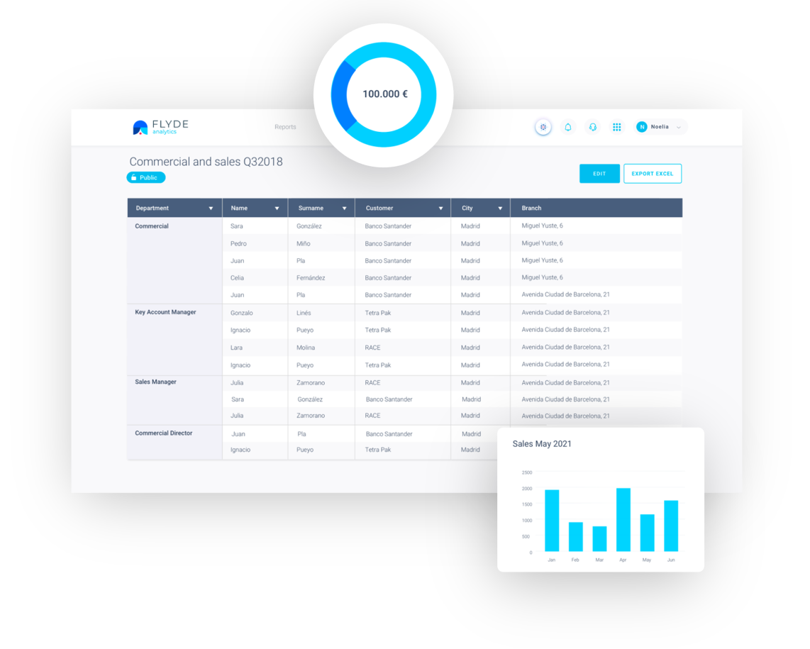
Reports live where the business can't reach
Every new chart is a ticket, every question a wait, and BI ends up being the territory of three people. The rest of the team decides with last month's report. Analytics gives the power of data to whoever makes the decisions.
Three steps, from question to report
Type it and the chart builds itself
Type “sales by channel, last quarter” and Analytics generates the visualization in seconds: it picks the chart type, combines the data and highlights what matters. Any business user, without depending on IT or knowing SQL.
The evolution of your data over time
Any metric over time: zoom in, compare periods, go from the month's snapshot to the year's movie. The time dimension stops being an analyst's luxury and enters every conversation.
Living reports for the whole team
Turn your charts into shared dashboards and reports that update themselves with FLYDE's data. Monday's committee stops arguing over Excel versions: everyone looks at the same number, up to date.
Brain, inside your reports
When the chart leaves you with a question, ask Brain without leaving: “why did March drop?”, “which segment explains the spike?”. FLYDE's conversational AI answers on your own data and turns the report into a conversation.
What's in the box
Natural-language charts
Describe what you want to see and Analytics builds it for you.
Visualization library
Bars, lines, pies, tables, funnels: the right format, suggested automatically.
Time evolution
Time series, period comparisons and zoom on any metric.
Shared dashboards
Living panels for teams and committees, with per-user permissions.
Automatic updates
Reports draw from Core's unified data: always up to date.
One-click export
Take the chart or report to your presentation or email.
Put the results to work in the rest of the apps
Analytics is the window: what you see in the reports is born from Core's data and activated with the rest of the apps.
 Core
Core Customer 360
 Market
 Trends